

ICON DESIGN
Title: Online Education
Medium: Adobe Illustrator
Size: 2 x 2 inches
Year: 2020
Description:
As I sat through my Graphic Design class on zoom, I started brainstorming different icons for our first assignment by creating thumbnails of the process of delivery, change of seasons, and online education. I chose online education to express the chaos in my student life caused by COVID.
I analysed the history of Icon design and noted a shift to minimalistic icons using basic Elements of Design like points, lines, shapes, and volumes. Specific examples include the tech giants and the Rio2016 Olympics logo portraying complex stories in simple ways. Therefore, I decided to re-sketch to ensure simplicity, universality, and memorability. I chose three icons displaying the theme of online education through transition, connection and learning. Using Adobe Illustrator, I applied the Principles of Design: unity, balance, emphasis and rhythm. After experimenting with the pen tool, I created three straight and curved orange lines depicting pencil and wi-fi, unifying the icons through shapes and colours. Additionally, I used elements like clicks and circles differently to give variation and meaning. I also used the ShapeBuilder tool to merge paths and create symmetrical shapes maintaining balance. Furthermore, by reversing the backgrounds in the second icon, I accentuated ground tensions using the Gestalt Principle to create emphasis. Additionally, I used complimentary colours to heighten contrasts but maintained similarity with elements through my colour studies. Finally, I suggested visual direction by the downwards and upwards location of clicks and visual weight by the focal point of the circle.

Transition of a pencil to a click

Connected via clicks through technology

Clicks signifying enlightenment
A glimpse of my process
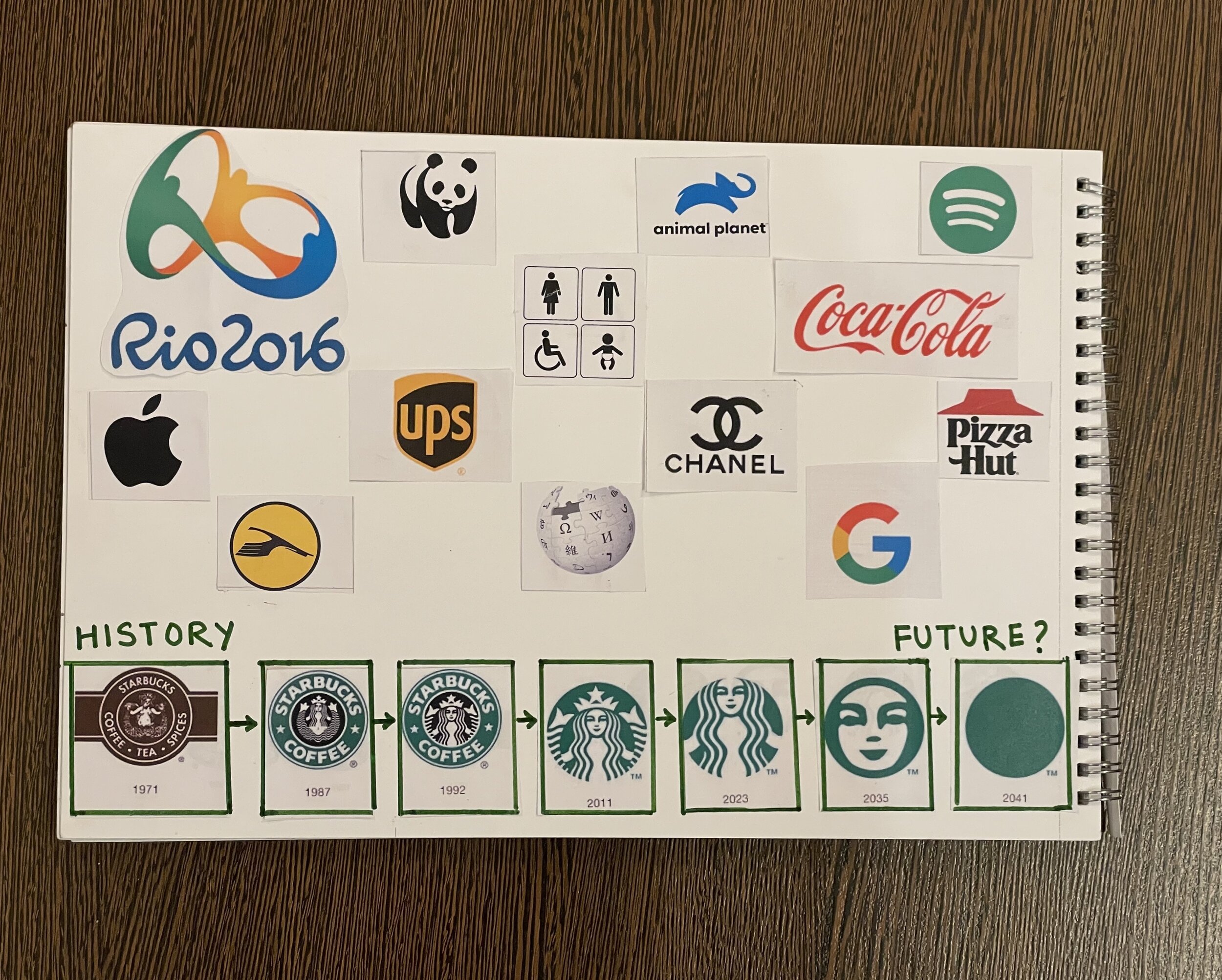
Logos I admire
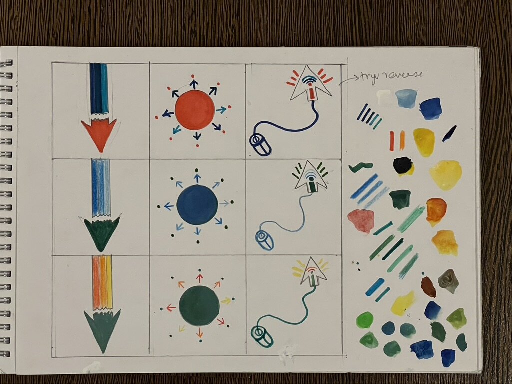
Color Study